2018 Colors of the Year

Every year the color authorities of the design world announce their choice for 'color of the year'. 2017 was a year of greens and deep neutrals, thanks to the choices made by Sherwin Williams and Pantone. Based on the 2018 colors of the year, we can foresee a bold and colorful year ahead of us!
Sherwin Williams

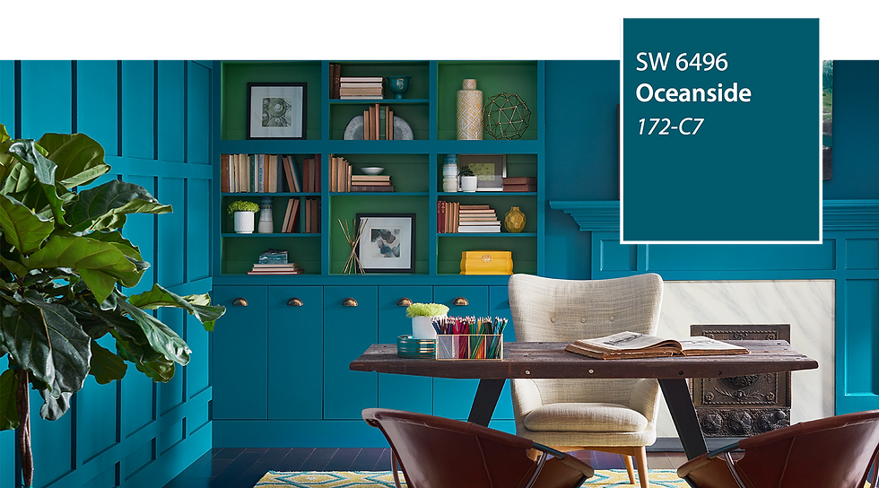
We are loving Sherwin Williams' Oceanside! It is a jewel-toned blue-green perfect for a bold statement front door or formal room. According to the rules of color psychology, blue/green tones boost creative thinking, making this color excellent for a home office. It also invites meditation in a bedroom or reading nooks.

Benjamin Moore

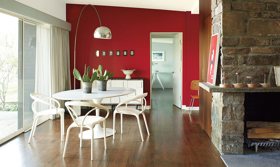
Benjamin Moore's Caliente might just be the perfect red! It isn't harsh and glaring like many red paints, it has a velvety look which makes it bold and luxurious. Red's color psychology in the home is complex, always running the risk of negative impacts. However, with the deep, lush quality of this paint the risks are side-stepped and only the positive impacts remain. Red is particularly great for a 'wow!' first impression in entry ways and front doors. It is also ideal for stimulating conversation in formal dining and living rooms.

Pantone

Pantone's Ultraviolet is a shock to the senses! It is bright and dramatic, it can be used on the walls for maximum effect or could be thrown in through pops of pillows and accessories. According to the color psychology of interior design, purple evokes creativity and stimulates thought. It also is known as the color of royalty, making it perfect for formal rooms with big impact!

Did you know we've branched out on social media? Click to check us out on:
Pinterest | Facebook | Instagram | Linkedin


Comments